Schlotzsky's Web Accessibility
Evaluating and proposing methods to meet WCAG 2.0 AA Accessibility for more user
With an ongoing concern regarding accessibility and a universal experience for their customers, Focus Brands came to Georgia Tech to evaluate the Schlotzsky's Austin Eatery online ordering platform and propose a new accessible experience. The primary objectives requested of us was to meet Web Content Accessibility Guidelines (WCAG) AA standards as well as refresh the experience for ocular-typical customers.
Our team of four interdisciplinary researchers conducted evaluations of the current platform and proposed opportunities to the Focus Brands team.
In this five-month project, I served as a UI/UX designer and User Researcher.


Research
WCAG Compliance
WCAG are the guidelines as set for by the World Wide Web Consortium (W3C) to ensure that online users with visual impairments are able to efficiently and successfully navigate the web. This compliance takes into consideration navigation by means of screen readers as well as visual contrast values. AA level compliance is the recommended conformance for most sites as it balances the needs of impaired users while also maintaining the majority of content for ocular-typical users. Sites rated lower than AA compliance are vulnerable to legal action should their navigation be too cumbersome for impaired users to reasonably use, effectively ostracizing a population.
Onsite Observation
Next, we needed to familiarize ourself with the brand with which we would be partnering. To achieve this, another research member and myself went to a local Schlotzsky's franchise to observe the environment, employees, and customers that may be expected. Each observer took note of the layout of the branding and layout of the franchise and well as try to understand the personality being presented. We then posed as naive customers and pressed the employee at the register for assistance and information.
Mobile and Web Review
After familiarizing ourselves with the product, we dove into the branding, pages, and layout of the Schlotzsky's mobile app and website. As Focus Brands owns multiple franchises including Cinnabon, Auntie Anne's, McAlister's, its sites follow a matching template. Focus Brands also utilizes Olo, a third-party vendor, to host and process its online ordering requests. When the vendor's content is accessed, the user's experience changes to one based on Olo's template and capabilities rather than Focus Brands' home experience. This jump may disorient users as well as provide some design customization limitations. The Schlotzsky's mobile app follows the Olo layout as well.


What it Offers
Competitive Analysis
To understand the business environment, we turned to competitors' ordering platforms as well as other Olo clients. This helped us understand the capabilities of Olo as well as prevent us from reinventing features that other companies have successfully implemented.


Social Listening
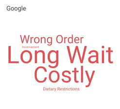
Next, I leveraged existing resources to analyze reviews of Schlotzsky's stores, iOS app, and Android app and coded similar themes into word clouds to identify the biggest successes and pain points current customers experience. These reviews were gleaned from Google, Googly Play, the App Store. Overall, roughly 300 reviews from the previous 365 days were observed and coded into the data set.
User Discovery
Being composed of members with typical vision, we were unfamiliar with the experience of a visually impaired user. To assist us, we reached out to Ricki Enger, a technology usability specialist who also experiences total vision loss. We conducted a remote, semi-structured interview with her, casting a wide net in questioning to lure out information we did not know to ask about. Enger enlightened us to the wide range that exists in visual impairments and their causes. Although we often think of vision loss as being 100% blind one's entire life, that is actually a rather unique scenario. Many users still retain some form of vision and have had a span in their life when they had no impairment at all. Another aspect is understanding different assistive tools and settings that enable visually impaired users to operate technology. This would lead us to discover the importance of screen readers and the tab through process when designing an accessible, digital product.
To round out our questioning, we also conducted an interview of a user living with colorblindness. This clued us in into spectrum as well as help us prioritize accessible features for the greatest impact.


Although the primary goal of this project was to create a better experience for visually impaired users, we acknowledged all users would be affected. A solution that only focused on screen reader optimization could adversely affect the primary users. Based on data Focus Brands shared with us, it was apparent that the largest consumer base lied in older audiences. However, these consumers were much more likely to go in-store rather than use a digital platform. Therefore, we angled our focus towards Shlotzsky's younger demographic as the early adopters of our new design.
Tab Through Analysis
I revisited the Schlotzsky's mobile app and website and conducted an analysis of how many steps it takes a visually impaired user to order a meal in the best-case scenario. The task used was to go from the home page to checking out with one basic sandwich.
Navigating the Schlotzsky's website using only tabbing and entering, it would take a assistive tool user a minimum of 103 actions to place an order. For comparison, a sighted user can complete the same task in a minimum of 20 actions.


Next, I activated the accessibility features installed on an iPhone 6 and used swiping and tapping to navigate. In this assessment, it would take a assistive tool user a minimum of 230 actions to place an order. For comparison, a sighted user can complete the same task in a minimum of 30 actions.


These analyses were not intended to be accurate of a assistive technology user's experience, but more to give us a general idea of where the problems lie. Screen readers are more likely to scan an entire page for context before moving on, while these tests measure the direct path. Regardless, the stark difference in steps is very apparent and is attributed to the ordering process's navigation through the customization process. Currently, users MUST go through the customization steps and cannot add a default item to the menu. Sighted users can simply scroll past this content, but the tabbing navigation selects each individual items multiple times, concatenating stress and risking abandonment.
User Journey
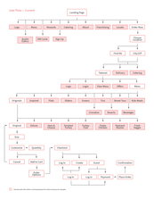
We created a series of journey maps tracking the steps a sighted and a visually impaired user takes to order a meal on both the website and mobile app. Along each step, we noted the expected pain points and satisfaction levels of the users.
Data Synthesis
More familiar with sighted and visually impaired users, Schlotzsky's online consumers, and the current user flow, we began to synthesize our data and build an affinity map detailing pain points and opportunities. This would lead us to define our implications that we would consider in our proposed solution.


Design
Ideation Session
Armed with these implications, our team separated to ideate screens that would improve the process. Afterwards, we gathered back together to share our concepts. From here, we began to mix and match each screen into three core emphases: Accessibility, Customizability, and Consistency.


Wireframes
Accessibility
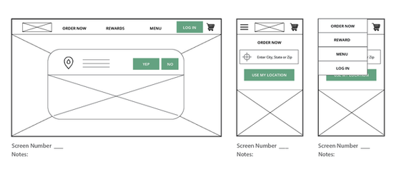
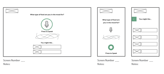
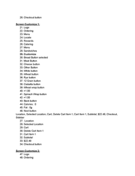
This concept focused on making the ordering process as easy as possible for visually impaired users. Because many VI users prefer to leverage features used on a phone, this design was accompanied by mobile concepts as well. The key features in this concept were keeping the number of tabs needed to a minimum and a voice recognition page that allowed VI users to order without the need for navigation.
Customizability
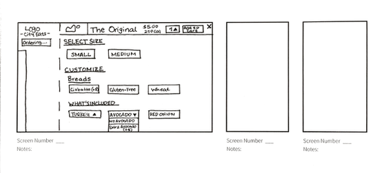
This set emphasized user control and flexibility. Users can skip customization and add items to their cart directly or save previously favorited items for quicker access in the future. This concept also featured an exploratory page that helped users filter for items based on their dietary restrictions and preferences. Features such as these were included as a process that assists visually impaired users while also providing new control for sighted users.
Consistency
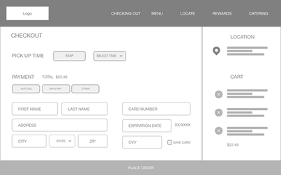
This concept sought to address the differing experiences between the Schlotzsky's home site and the Olo-hosted ordering site. The pages were redesigned to maintain consistency throughout the process.
Wireframe Evaluation
Cognitive Walkthrough
Before we shared our concepts with users, we conducted a cognitive walkthrough to carefully read through every design and lure out any opportunities or fixes. This would prevent us from having users evaluate unnecessary or overlooked features and layouts.


Chalkmark Testing
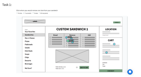
We ran our designs through OptimalWorkshop.com to identify successes and opportunities in our layouts. These three options were shared through a link to procedurally randomize each test to ensure an equal number of participants per evaluation.
Rapid Usability Testing
Having vetted the sketches for basic issues and features, each team member presented a series of tasks to confirmed online ordering users and asked them to walk us through their experience. We then discussed our findings one-by-one with each design and marked ideas for a refined direction.
Combined Wireframes
Synthesizing our collective feedback, we once again picked successful pieces of each design to form an amalgamated design to hopefully address the needs. of as many users as possible.
Continued User Testing
With a single design and flow decided upon, we once again sourced participants to evaluate the design for usability and satisfaction. Each user was given basic tasks to complete and asked to think aloud as they navigated through the site. Each experience was followed with a SUS evaluation for quantifiable results.
Wizard of Oz Testing
Thus far, our design was only tested for the visual experience, but our primary purpose for this design was to make it more inclusive. This meant that we needed to test our design with a visually impaired user. As stated before, visually impaired users often utilize screen readers to navigate and understand a screen. However, because we were going through rapid ideation, it would be ineffective to dedicate the time to build an entire tagged site for a user to test. Instead to mimic this experience on a more practical scale, we developed a script of each page and the order of selections and had a member act the part of a reader. Again we turned to Ricky Enger to evaluate our design and reveal techniques and solutions to improve the assistive experience.
Refined Design
Interactive Prototype
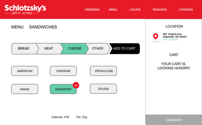
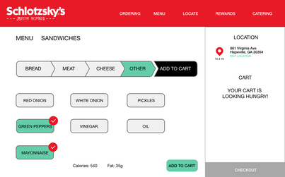
Next, I expanded upon our wireframes and built them into an interactive prototype using Adobe XD. Our updated design featured a variation of the imagery and branding of Schlotzsky's to present a more complete picture. Color were chosen based on Schlotzsky's palette as well as based on indication and contrast. The goal was to get the proposed prototype to a state to where it could be tested against the current Schlotzsky's process through an A/B test.
Evaluation
A/B Testing
Because this project is a redesign, the true measure of success is how it compares to the current Schlotzsky's process. If we had not improved upon the design, then we must revisit our solution. Additionally, this would help us measure key performance indicators of gauging general process success for posterity. To keep the two processes on a level field for the testing experience, I also recreated the current Schlotzsky's as an interactive prototype in Adobe XD. We then developed a set of mirroring tasks for users to complete for each prototype. With one moderator, the remaining researchers tracked each user's time, clicks, error rate, and satisfaction of each task.
Results
Section Under Construction
Come back soon to see the final story.

